Straight to the point – what did I do?
I took care the whole project from the concept to the illustrations and design.
I created the strategy and design proposal as well as the quotation / pricesheet.
Project made for Greenpepper Agency.
Who?
The Opéra Royal de Wallonie-Liège is one of the three major opera houses in Belgium.
Its reputation attracts a loyal local and regional audience as well as opera lovers from abroad, especially from Germany, the Netherlands and France.
What?
The Opera launched a call for projects for the new season in which we were fortunate enough to be able to participate. The brief was simple: to devise a global concept, with variations to cover the next four years. This concept had to respond to the major challenges of the industry, while taking into account the Opera’s desire to develop its audience and appeal to younger people.
Positionning
Opera is a wonderful breeding ground for living art, emotions and playfulness. We have to succeed in rediscovering all this in the message conveyed by the shows performed, building on the productions of past seasons.
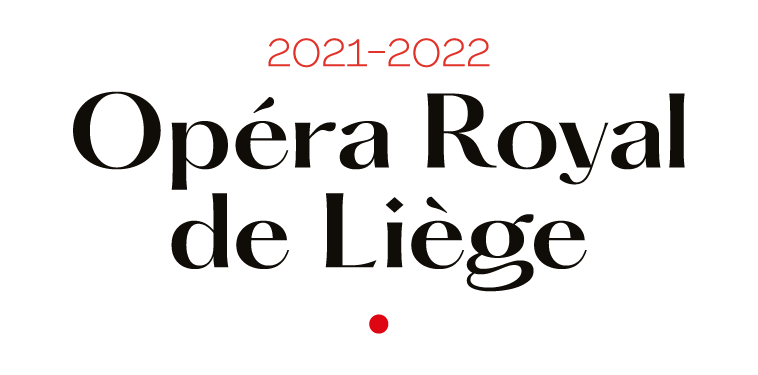
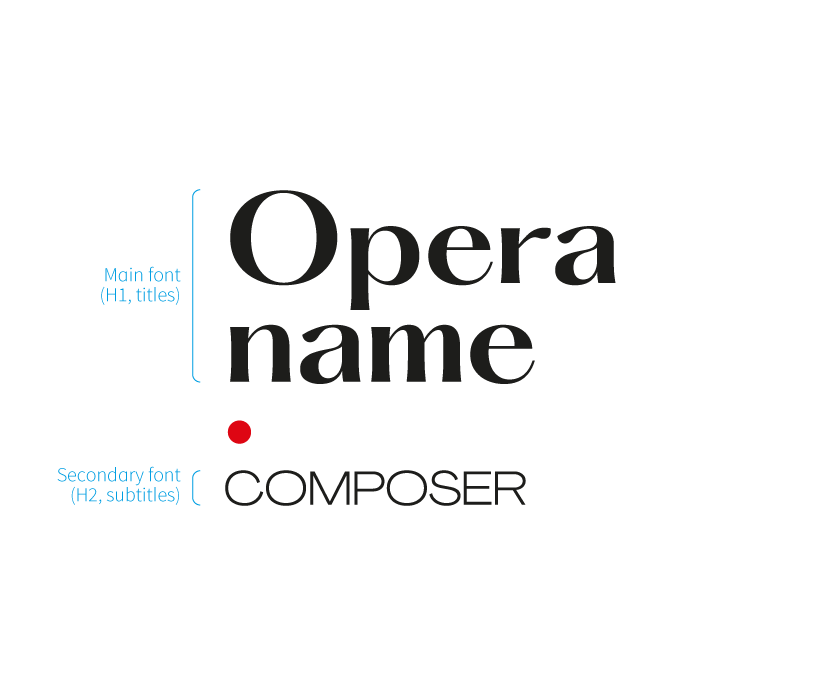
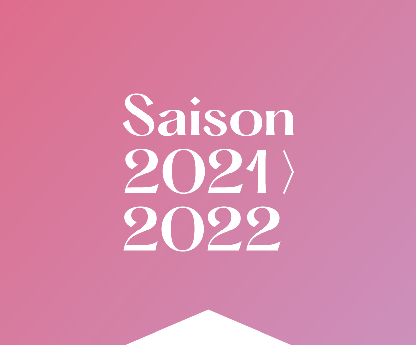
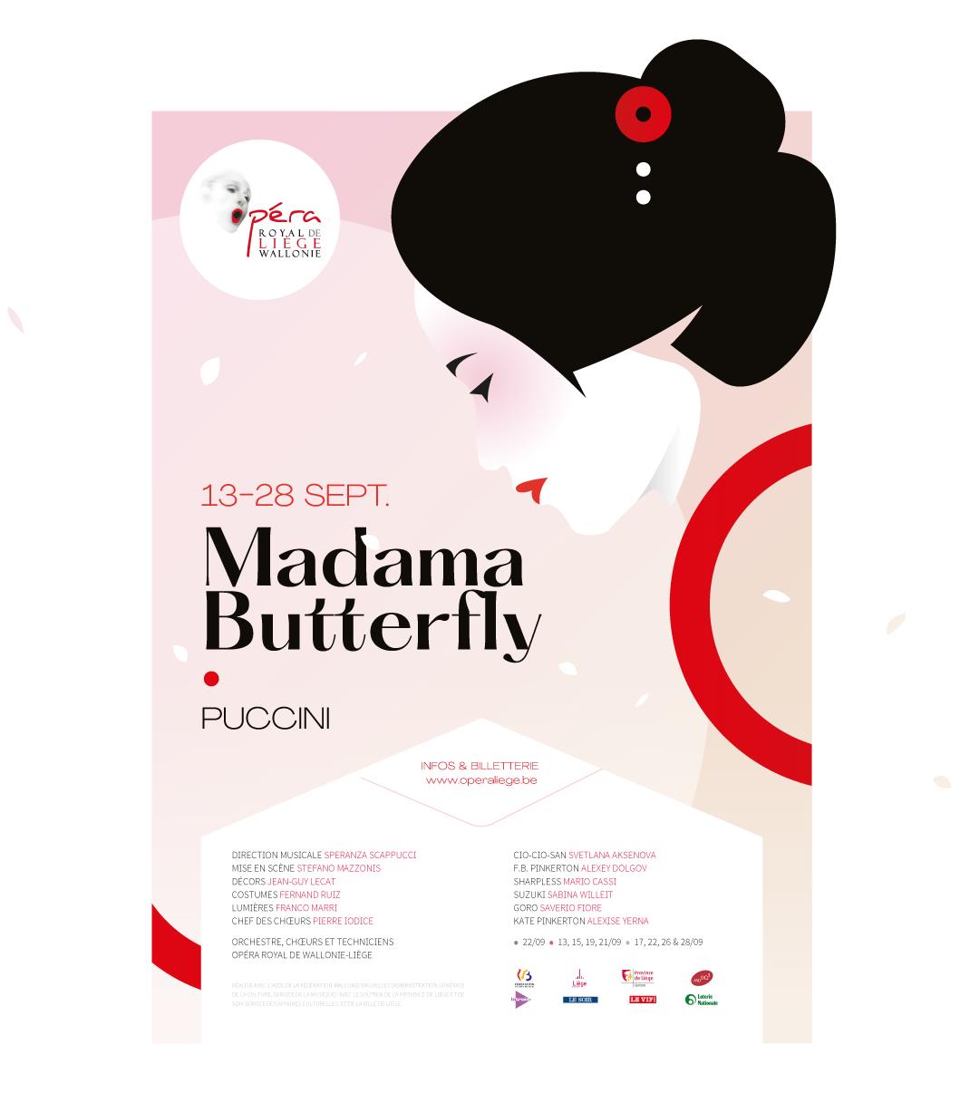
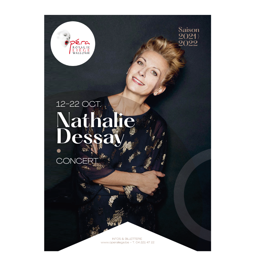
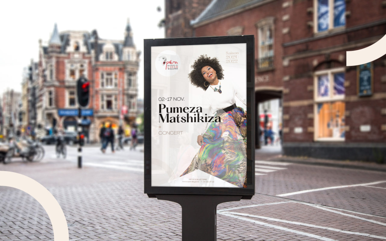
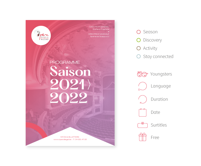
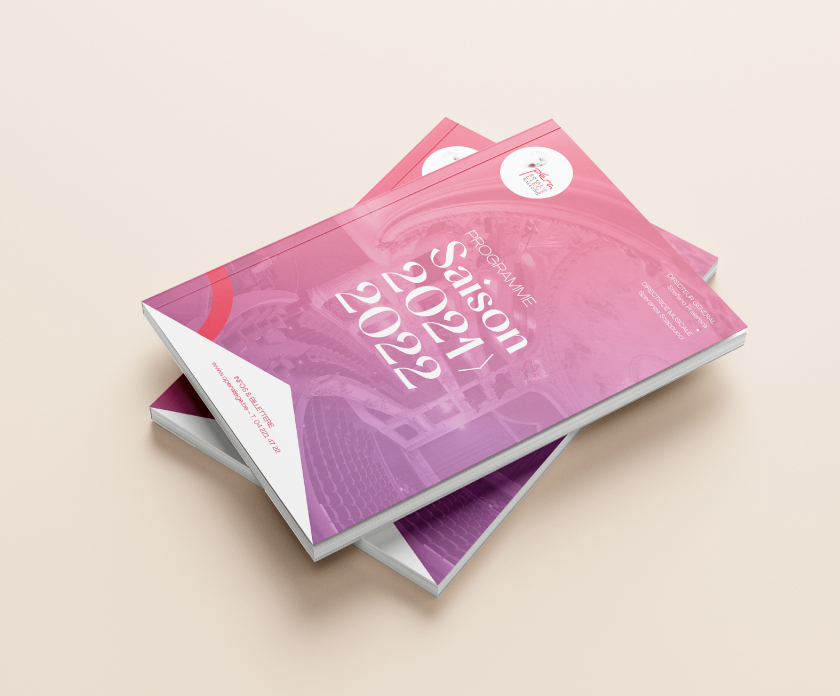
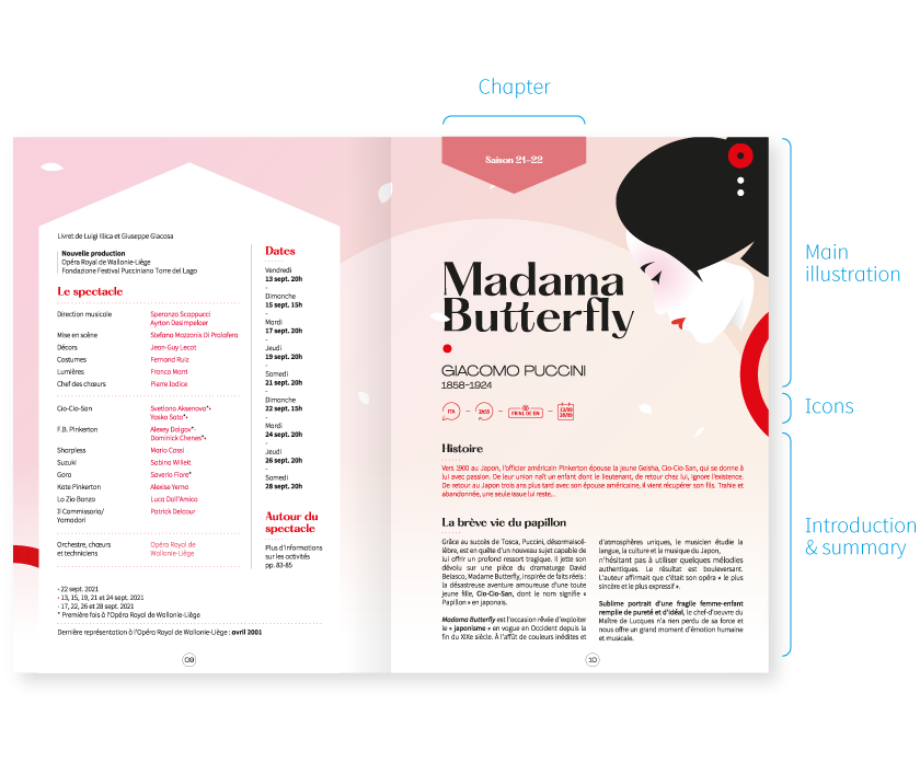
My proposal is in line with their change dynamic initiated during previous seasons. I decided to lighten the design in favour of more modern, purer visuals. I created graphic illustrations verging on the abstract, combined with a contemporary typography (created by typographer Mathieu Desjardin) as the central point of the new message.
This very visual combination allows us to perpetuate the vision implemented during previous seasons, pushing the notion of concept and illustration a little further. These tranquil, light and eye-catching visuals will appeal to younger people without bewildering the current opera audience.
My proposal
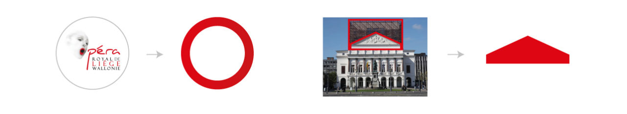
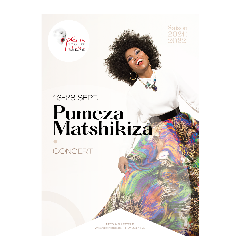
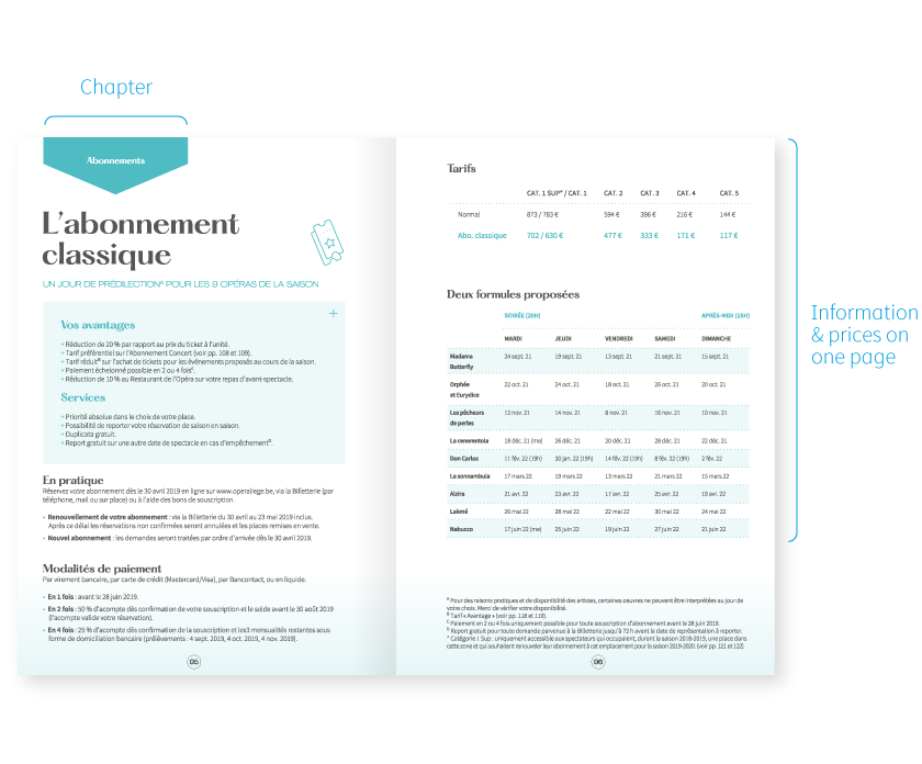
I used the graphic identity of the opera and the architecture of the building (post 2009 renovation) as a starting point. This brought us to two elements: the roundness and the shape of the pediment. These two elements form a common theme throughout all the media produced for these four seasons.
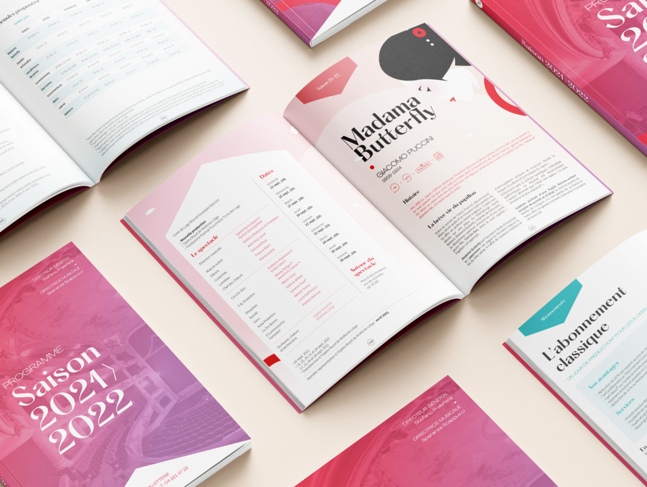
Coupled with the typographic choices and vector illustrations, we produced variations of the identity for printed and web media.
Opera poster
Programme
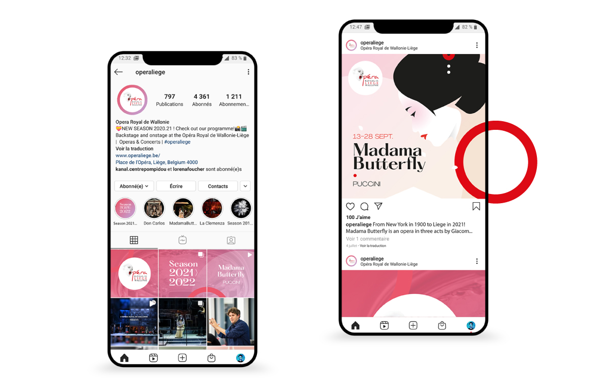
Social