Straight to the point – what did I do?
I was in charge of the whole project from price positioning to design. I developed the strategy, found the name, led the wordshops and brainstorming sessions with the team.
I also took care of the branding, motto and webdesign.
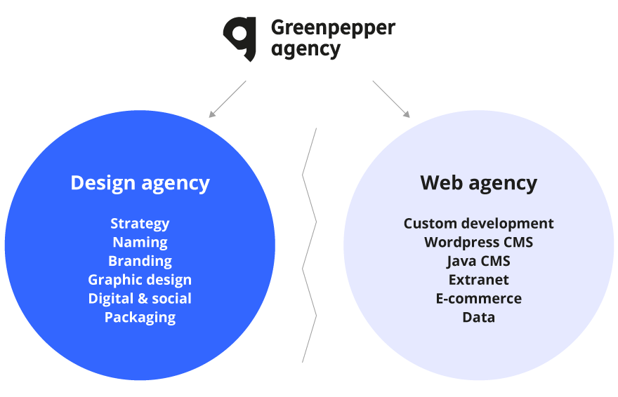
Project made for Greenpepper Agency.
Preamble
Greenpepper is a communication agency that has been established in Belgium for more than 15 years. Our small but enthusiastic team focuses on intelligent marketing, putting forward innovative solutions in all media, from design to the web and events.
Each project allows us to see further, to challenge our clients to find the key distinguishing factor, the added value that will engage and inspire our audiences.
After so many years offering strategy, design and digital services, we decided to split the company into two specialized entities:
- one entity specialized in communication strategy, naming and branding;
- and a second entity dedicated entirely to web development.
Briefing
The brief for this first entity was simple yet tough. We needed a new name, a new identity, positioning, process, tone of voice and website. The full package!
Having gotten over the terror induced by the blank page, I went to work.
First step: positioning and strategy.
Positioning
Backed up by my recent UX certification from the Nielsen Norman Group, I focused my thinking from the outset on integrating the end user by placing empathy at the heart of our processes.
Once this idea had been refined, we tackled the hard part: work on our brand core (objectives, vision and mission) – positioning (target audience, brand voice) – persona (personality, tone of voice).
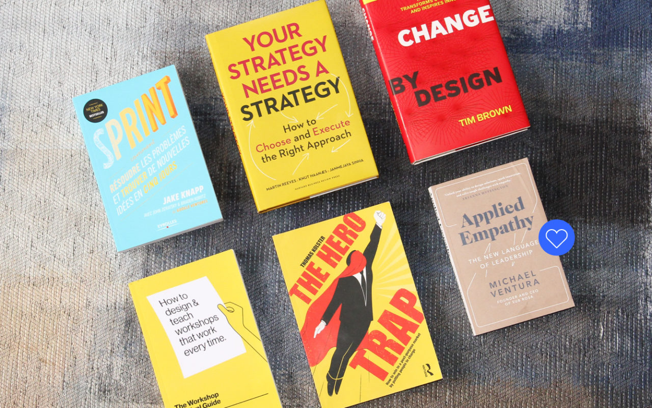
After a lot of research and reading (thanks to the excellent second-hand bookshop Pêle-Mêle and Amazon), I decided to focus our processes on smart branding by developing a twofold approach integrating design thinking and UX.
This dual methodology allows us to develop a collaboration with our clients while starting from the end user by enhancing retention.
Services
We offer four main services:
Strategy – Naming – Branding – Graphic design (print or web UX UI).
The focus will be on branding. Although strategy lies at the heart of all our thinking, branding will be our core product. Branding will be possible in two formats depending on the client profile:
- a standard waterfall model: understanding (kickoff meeting), research, design, client presentation and validation;
- a design thinking / UX approach: branding workshop with the client (defining or clarifying their objectives, vision and mission), in-depth research, design, internal design shortlist (either following internal brainstorming or through focus groups), client exchanges and validation.
Operational
& strategy
Implementation of a dual strategy: a standard strategy (analyze, plan, execute) + an adaptive strategy (vary, select, grow). To develop the adaptive approach, we introduced the 20% project created by Google in 2013. We allocate 20% of our time to research, creative project development and innovation.
Spread out over two mornings, these work sessions are dedicated to:
- carrying out graphic research / tests;
- keeping abreast of new products, trends, designers or artists;
- developing ancillary projects (screen printing workshops, fashion, social or charity projects, etc.).
The aim is twofold:
- to develop open-mindedness and curiosity within the agency;
- to encourage personal initiative and de-dramatize failures by launching test-fail-adjustment loops.
Naming
Exit Greenpepper Design, GP design or other colleagues. What’s needed is something new, fresh, impactful! Above and beyond the creation of the company’s brand, this name will underpin the tone of voice adopted by the agency. It must be light, directed at what we do and slightly conceptual. It should tell a story, if possible with a smile (not a laugh), introducing the agency’s empathetic approach.
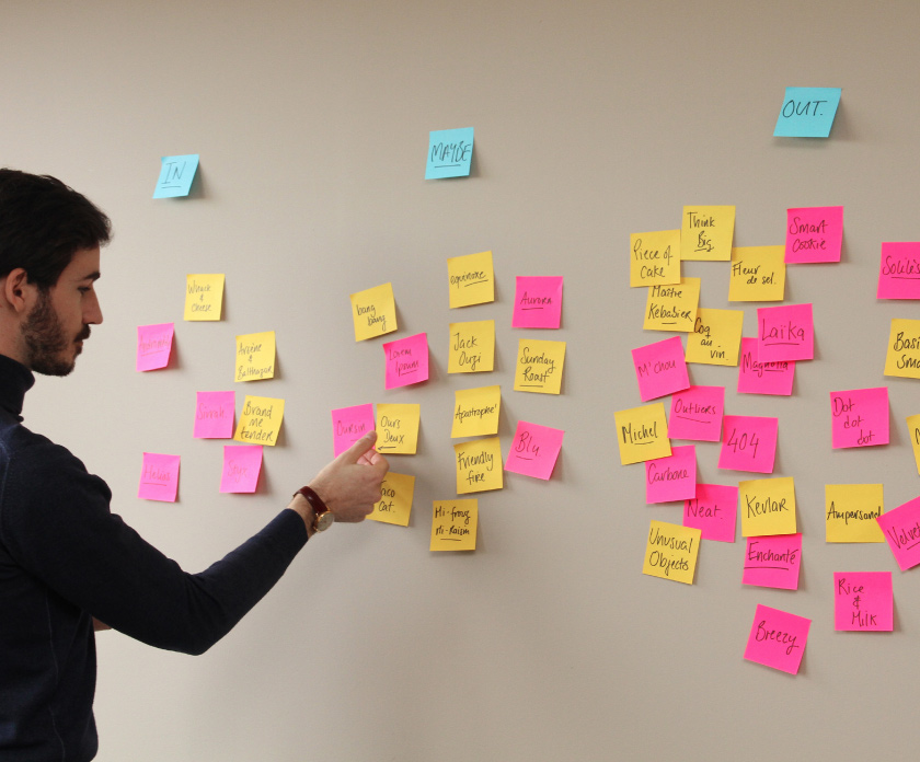
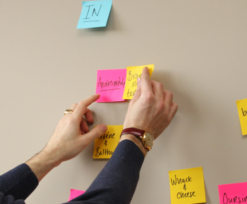
Using the divergent thinking method, we came up with about 50 names, as many post-its, a few Google sheets and a Typeform. Six names were shortlisted and then discussed until a winner emerged:
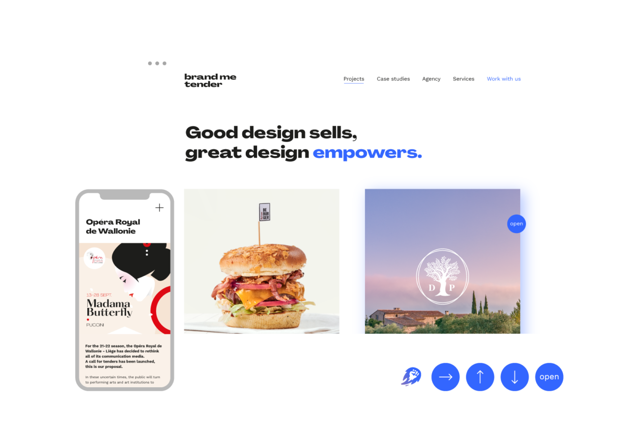
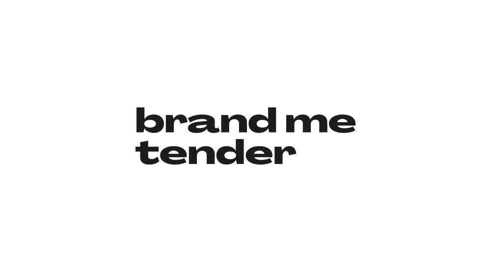
Brand me tender
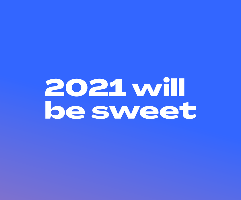
A light name which includes our core service (branding), the empathetic side of our positioning (tender) and a nod to Elvis Presley that music lovers will appreciate.
This name tinged with humor is a good ice breaker for the first client/prospect presentation meetings. It conveys an aura of (justified) sympathy.
Branding
To counterbalance the off-beat aspect of the name, we needed to design a solid, simple logo free of superfluous graphic elements. We started with a moodboard and sketches to provide a basic framework for our graphic research.
A few lines of research:
Restraint – Timelessness – Balance – Strength.
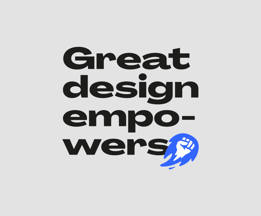
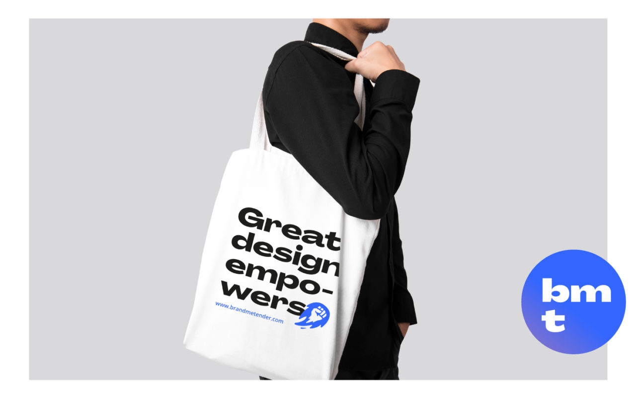
Once all these tests had been carried out, it was decided that the answer lay in bold, or even extrabold or extended. There is no need to add a graphic element or monogram. The name alone conveys a great deal, so we aimed to create a typographic logo.
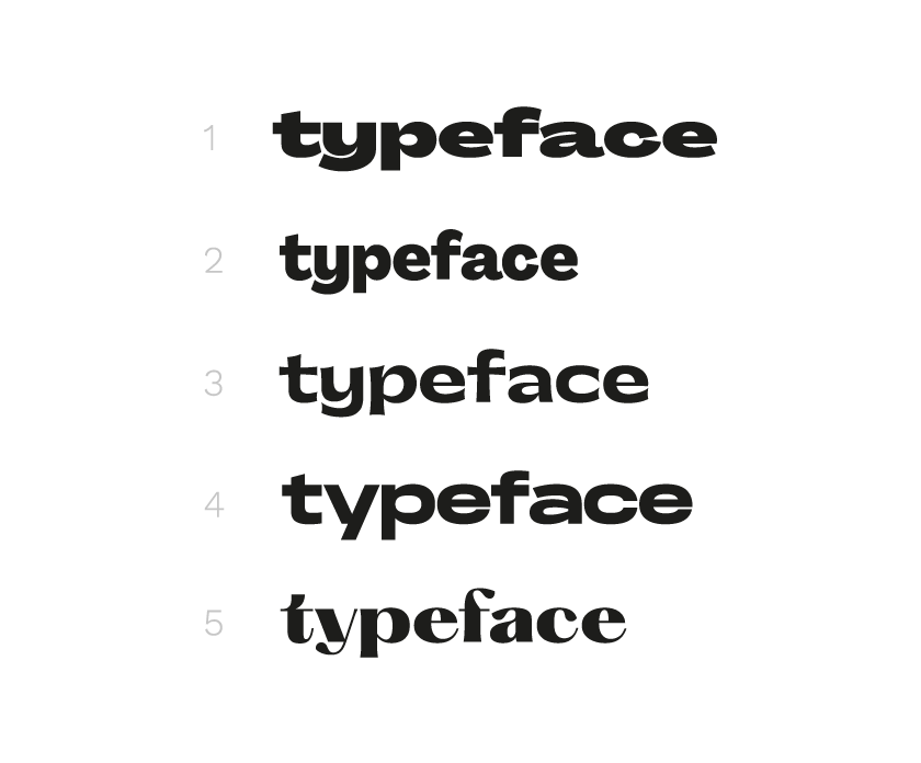
Typography
Several typographers were considered, including Mathieu Desjardin of the Pangram Pangram foundry. The typography chosen is timeless, both gentle and stable, delicate and solid. It provides exactly the presence we wanted.
The dynamic conveyed by the curves is incredible, almost perfect. All the letters have been carefully considered, down to the smallest detail. Not a single return or space needs to be reviewed. We were immediately won over by the exactness of the curves, the lines, the approaches used.
This is the final result:
Thank you for taking the time to read this article, see you for the next episode!
Take care,
Yann